Wabi-Sabi Interior Design: The Japanese Art of Imperfection
Feb 23, 2026 · 7 min read
Wabi-sabi interior design embraces imperfection, transience, and natural beauty. Learn the philosophy, key elements, color palette, and how to apply wabi-sabi principles to every room in your home.
Wabi-sabi is one of the most misused terms in contemporary interior design. It appears routinely in design articles as shorthand for "rustic minimalism" or "natural decor" — which misses the depth and specificity of what wabi-sabi actually means, and what authentic wabi-sabi interior design looks and feels like.
Understanding wabi-sabi as an interior design approach requires engaging with the philosophy before the aesthetics — because the visual language only makes sense in the context of the values it expresses.
The Philosophy of Wabi-Sabi
Wabi-sabi is a Japanese aesthetic concept rooted in Zen Buddhism. It emerged in the 15th and 16th centuries partly as a reaction against the ornate, gilded Chinese aesthetic that dominated the Japanese imperial court — a conscious embrace of simplicity, poverty, and the quiet beauty of common things.
Wabi originally described a sense of solitary poverty — a hermit's humble dwelling, the austere satisfaction of having little. Over time, it evolved to describe a quality of simple, unpretentious beauty.
Sabi described the patina of time — the way iron rusts, silver tarnishes, wood grain deepens with age, paper yellows, paint weathers. Rather than loss, sabi describes the beauty that emerges through the passage of time.
Together, wabi-sabi is a worldview: beauty is found in the imperfect, impermanent, and incomplete. Nothing is meant to last forever. Everything shows the evidence of its making and aging. This is not a deficiency — it is the source of authentic beauty.
Applied to interior design, this philosophy produces spaces that are profoundly different from those shaped by aspirations to perfection, timelessness, or status.
The Visual Language of Wabi-Sabi Design
Natural Materials in Their Raw State
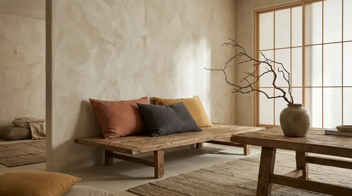
Wabi-sabi material philosophy is straightforward: choose materials as close to their natural state as possible. Oiled or unfinished wood that shows its grain, knots, and natural color variations. Handmade ceramics with visible throwing marks, uneven glazing, and the slight asymmetry of human making. Natural linen and undyed cotton with visible weave texture. Raw stone, terracotta, and clay.
Processed, polished, or synthetic materials are incompatible with wabi-sabi because they lack the evidence of time, making, and natural origin that the philosophy requires. A perfect laminate floor is not wabi-sabi regardless of its color; an aged, oiled pine floor with visible wear is.
Handmade and Aged Objects
The objects in a wabi-sabi interior should feel made by human hands or shaped by time. Handthrown pottery for kitchen storage and display. Vintage or antique furniture with genuine patina. Handwoven textiles with natural color variation. Collected natural objects — sea-smoothed stones, dried botanical stems, a piece of weathered driftwood.
These objects are chosen for their quality of attention — each was made by someone who cared about the making, or was shaped by natural processes over time. They carry a kind of aliveness that mass-produced objects don't.
The Wabi-Sabi Palette
Wabi-sabi color is derived from nature in its most quiet, aged forms:
- Aged white / warm off-white — the color of old paper, aged linen, bleached wood
- Sand and warm clay — the earth tones of riverbed and dry soil
- Stone gray — muted, warm gray with blue or green undertones
- Charcoal and soft black — the color of aged iron and deep shadow
- Moss green — the muted, earthy green of weathered vegetation
- Warm tan and amber — the color of aged wood and dried grass
The palette avoids bright, saturated colors entirely. Pure white feels clinical; vivid colors feel synthetic. The goal is a palette that feels like the room itself has aged into its colors rather than being deliberately painted them.
Texture as the Primary Language
In the absence of color drama, wabi-sabi interiors create visual interest through texture. The roughness of raw plaster against the smoothness of river stone. The fine grain of oiled oak against the weave of a linen cushion. The matte softness of aged terracotta against the hard, cool surface of a slate floor. Contrast of textures is the primary compositional tool in wabi-sabi design.
This makes material selection more important than in almost any other interior style. The difference between an oiled wood floor and a finished wood floor is not just appearance — it's tactile quality, the way the space feels underfoot, and the way it will age over decades.
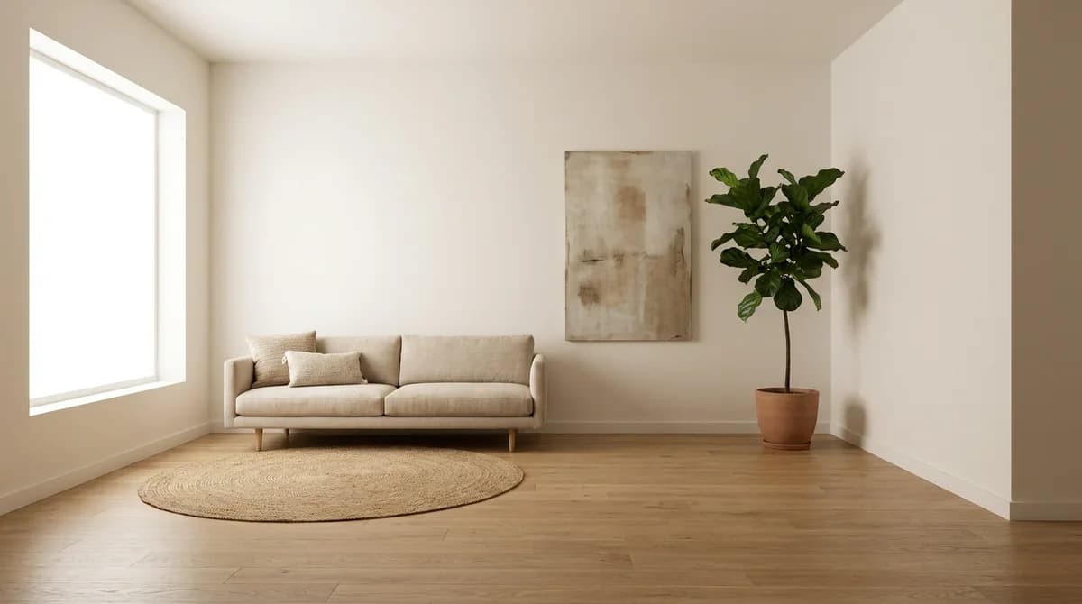
Negative Space
Like Japandi and minimalism, wabi-sabi uses negative space deliberately. But where minimalism creates emptiness as a statement of control, wabi-sabi creates space as a form of breathing room — allowing the objects present to be fully appreciated rather than competing with visual noise.
A wabi-sabi shelf doesn't hold everything; it holds three objects, chosen for their complementary textures and quiet meaning. A wabi-sabi room doesn't fill every wall; it lets the light move across a bare plaster surface as an event worth noticing.
Room-by-Room Wabi-Sabi Design
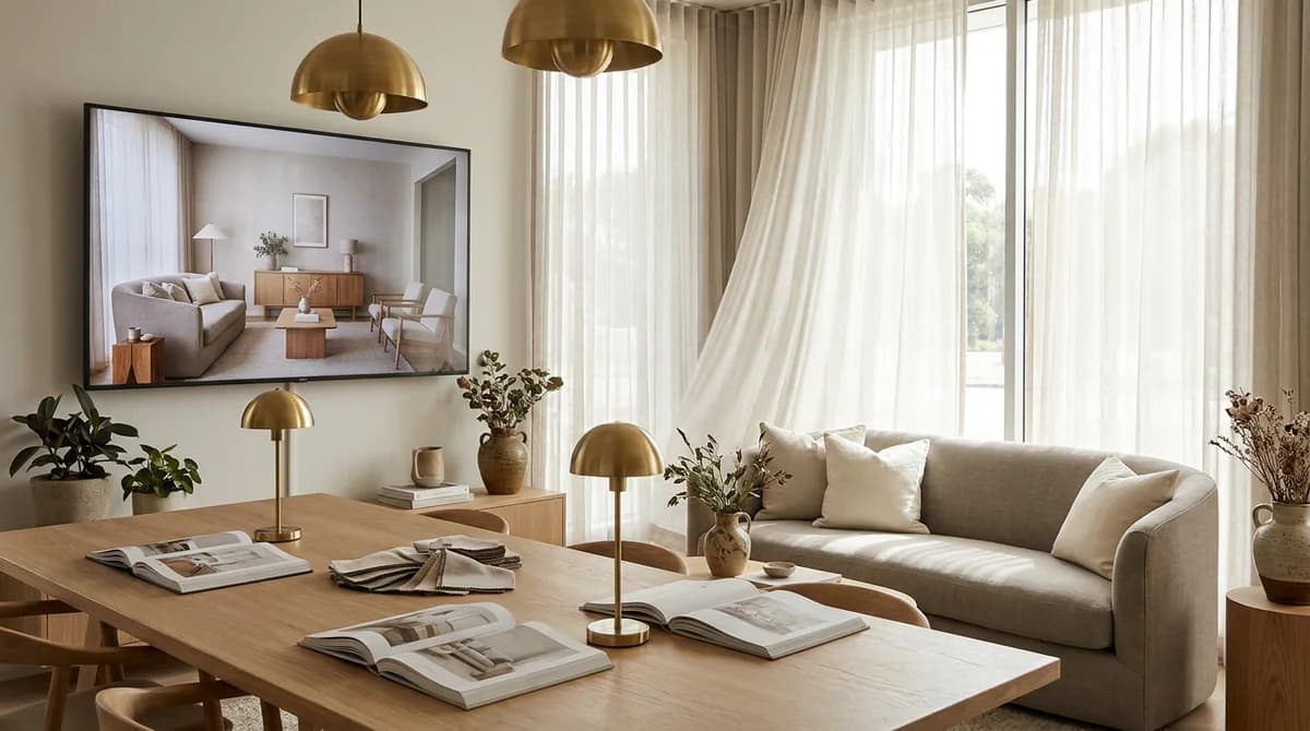
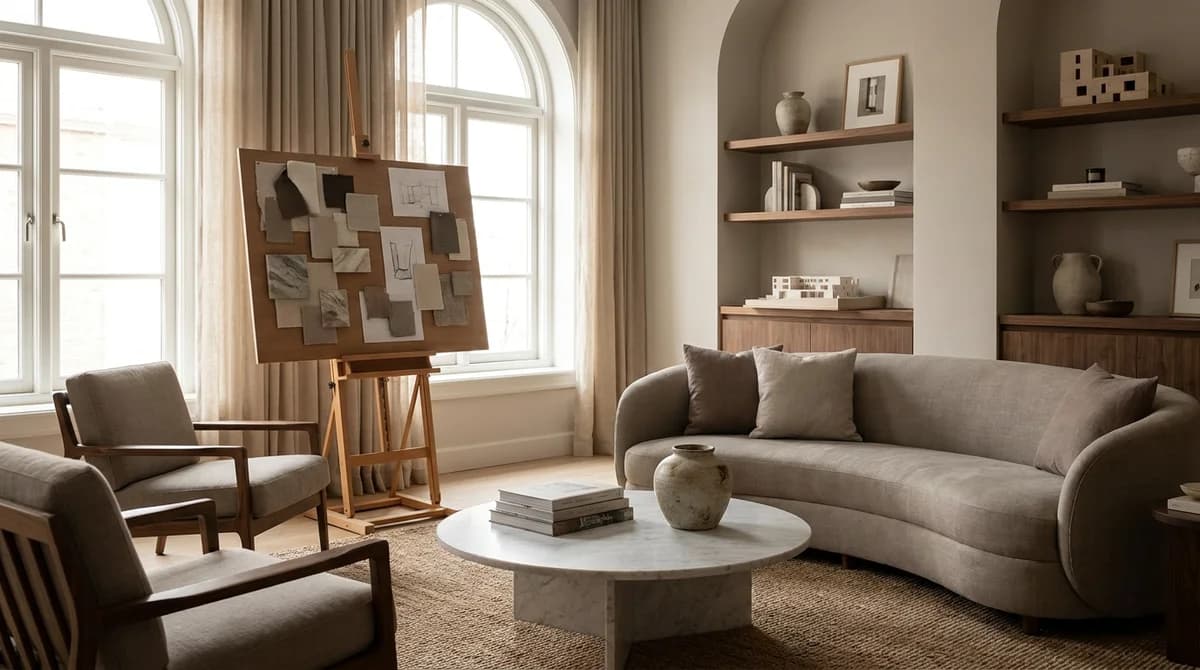
Living Room
- Natural linen or raw cotton sofa in warm off-white or sand
- Aged wood coffee table — a single piece of live-edge timber or a worn-surface antique
- Handmade pottery and natural objects on minimal open shelving
- Linen or jute rug with visible texture
- Simple paper or ceramic pendant lamp in organic form
- Dried botanical arrangements as the only "decoration"
Bedroom
- Linen bedding in undyed natural or warm white
- Wooden bed frame in oiled, unfinished wood — showing the grain
- Handmade ceramic vessels on simple bedside surfaces
- Single dried stem or botanical print as the only wall art
- Natural fiber mat on bare wooden or stone floors
Kitchen
- Open shelving displaying handmade pottery, worn wooden cutting boards, and dried herbs
- Raw stone or aged wood countertops
- Ceramic or enamel sink with natural aging patina
- Dried botanical bundles hung from a ceiling hook
- Simple iron or matte black hardware throughout
Wabi-Sabi vs. Japandi
Wabi-sabi and Japandi are closely related — Japandi explicitly incorporates the wabi-sabi philosophy within a Scandinavian-influenced framework. The practical differences:
Japandi is warmer and slightly more accessible: it uses comfortable Scandinavian furniture proportions, slightly more color, and a palette that includes some contemporary elements. It's the meeting point of two cultural aesthetics.
Wabi-sabi is more austere, more philosophically committed, and more demanding. Its palette is more muted, its materials more raw, and its relationship with aging and imperfection more deliberate. A pure wabi-sabi interior has no Scandinavian influence — it is entirely Japanese in its cultural reference.
For most homeowners, Japandi offers the more livable version of the same underlying philosophy. For clients committed to the full depth of the wabi-sabi worldview, a more austere interpretation offers the more authentic expression.
AI visualization tools can help you explore the continuum between Japandi and full wabi-sabi aesthetics in your actual space — seeing how different material choices and palette decisions affect the atmosphere and emotional quality of a room before any purchases are made.
Try wabi-sabi design in your room — 10 free renders, no credit card required →
Sources & References
- American Society of Interior Designers (2024). Interior Design Outlook and State of the Industry. ASID Research.
- Houzz (2024). Houzz Home Study: Emerging Design Trends. Houzz Research.
Ready to transform your listings?
Stage your first room in 20 seconds. No design skills needed.